How to Choose the Best Photos for Your Website
Your website photos are doing more work than you probably realise. Before a visitor reads a word of your copy, your images have already told them something: whether you’re someone they’d actually want to work with. The right photos carry your brand messaging in a single glance. The wrong ones, or none at all, can quietly undo all the work you put into your words.
So how do you actually choose the best photos for your website? Here’s where to start.
Choose images with impact. The best website photos stop the scroll, connect with your audience and actually resonate with the people you want to work with. I go into this more in Images with Impact, but the short version is: aim for more than a handful of pretty smiley pictures.
They need to showcase your brand messaging. Every photo on your site should be saying something about who you are and what it’s like to work with you, not just filling space. If you want to know more about getting this right,checkout 3 ways to showcase you in your branding photos.
Skip the stock photos where you can. Generic stock images might fill a gap quickly, but they don’t tell your story and they definitely don’t help you stand out. Creating custom stock photos of your own workspace, products or details gives you something far more aligned with your brand, and you’ll never have to dig through a stock library again.
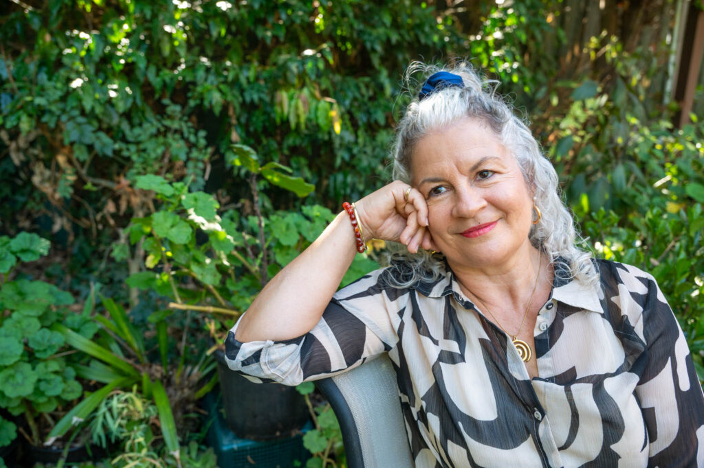
Let your personality shine. Smiling headshots have their place, but they can’t carry every part of your messaging. Sometimes you need a thinking face, a laughing photo, a moment of genuine focus. I talk about this in When Smiling Shots Just Won’t Do.
Go high resolution. Blurry, pixelated or low quality images make even a beautifully designed website look unfinished. High resolution photos (handled correctly, so they don’t slow your site – see below) instantly lift the professionalism.
Photos to Include on Your Website
Rather than thinking about photos as one big list, it helps to think about what each part of your website actually needs.
Hero image
The large, attention-grabbing photo at the top of your homepage. This is your big first impression and works best when it shows you in your business or speaks directly to your brand messaging.
About page
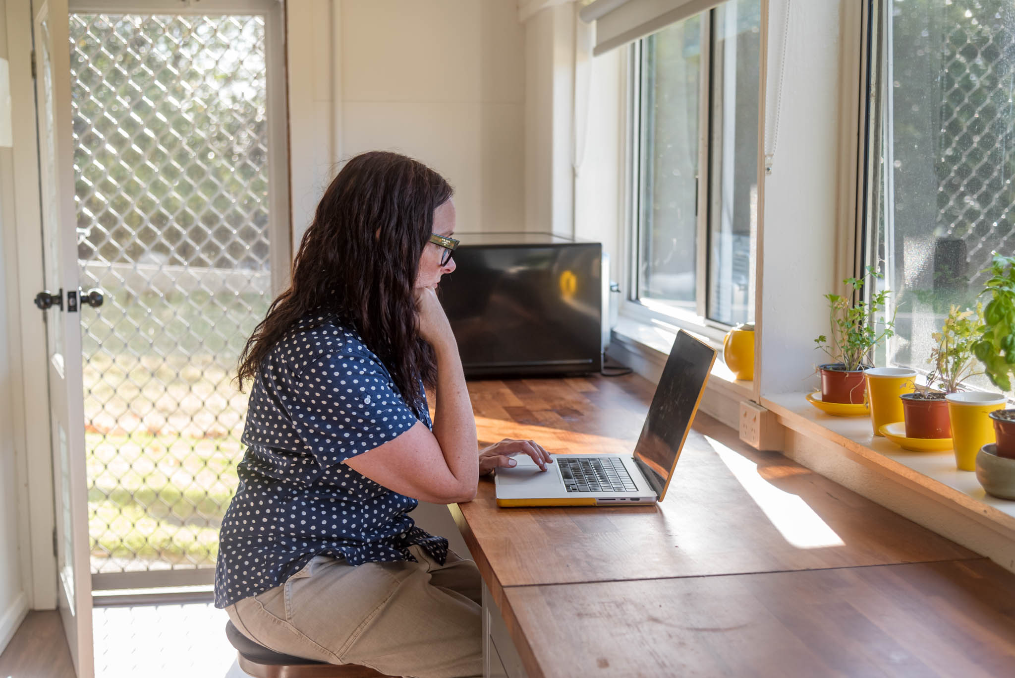
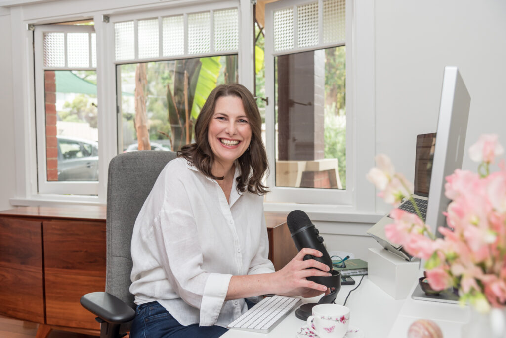
Your about page is one of the most visited pages on any website, because people want to know who they’re working with before they commit. This is the place for a strong headshot or lifestyle image (or a few), that shows your personality beyond the camera smile.
Banners for other pages
Service pages, contact pages, blog posts and landing pages all benefit from their own banner image, ideally something relevant to that specific page rather than reusing your homepage hero everywhere. Think lifestyle, action or workplace shots that tie into what that page is actually about.
Breaking up text
Long pages of copy need visual breathing room. This is a great spot for didn’t-quite-make-hero-status shots and custom stock-style photos: your workspace, props, details, products, anything that adds to the story.
eCommerce
Product offerings may require both photos with plain backgrounds and lifestyle photos showing the product in place or in use, as this makes it easier for visitors to visualise. Be sure to include close ups of details if they’re not obvious in the wider photos.
The types of images you’ll want across these spots:
- Headshots. Multiple expressions and crops, not just one safe smile
- Team photos. If you’ve got a team, show them
- Product or service photos. Whatever you’re selling, show it clearly
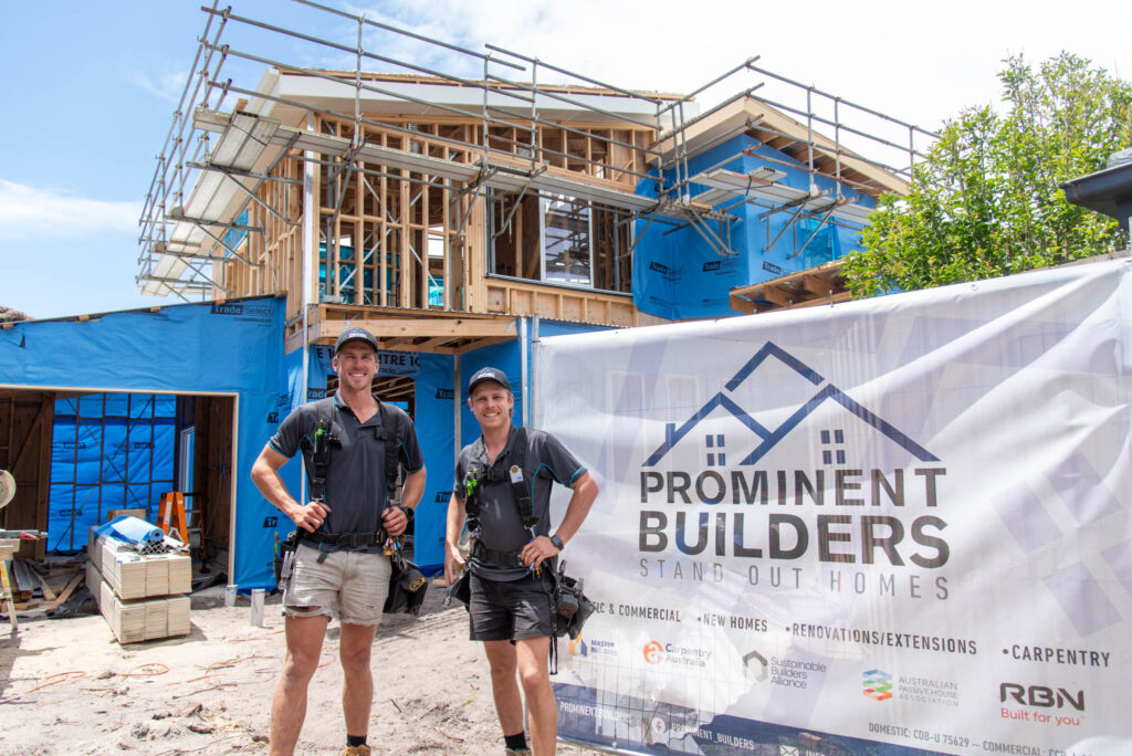
- Workplace photos. Especially useful if you have a physical location clients may visit
- Lifestyle and action photos. You doing the work, in your element
- Custom stock photos. Workspace, props, details that reflect your brand
- Event photos. From workshops, launches, networking, speaking engagements
- Logos. Your own branding, plus any partner or accreditation logos worth displaying
Composition matters too. A hero image generally needs extra negative space, particularly if there’s text or a button sitting over the top of it. And you may need a different variation for mobile versus desktop. A square or vertical crop might suit your about page, a social tile, a content shot while a wide horizontal crop is often better for a full-width banner or divider.
Why Consistency Matters More Than Perfection
It’s tempting to think your website needs just one perfect, polished photo and you’re done. But consistency does more for trust. When someone lands on your homepage, clicks through to your about page, then checks your services, they should feel like they’re getting to know the same person the whole way through. Same energy, same vibe, same you.
This is where showing up as yourself, in your actual workspace or your happy place, pays off. Photos taken in your real environment (your desk, your studio, your shopfront, your favourite park or cafe if that’s where you do your best thinking) with your tools of the trade wearing your wardobe tell visitors something a studio backdrop, makeover and stylist never can.
That consistency builds trust in a quiet, cumulative way. It’s not one dazzling photo doing all the work. It’s the steady, recognisable thread running through every page that makes someone think “I know what I’m getting here,” before they’ve even sent an enquiry. And this can extend throughout all of your marketing collateral.
What Size Should Photos Be for a Website
Image size for websites varies depending on where the photo is being used and which platform your site is built on. A full-width hero image needs to be much larger than a small thumbnail in a blog post, for example. Most website platforms (WordPress, Squarespace, Square, Wix and others) have their own recommended dimensions, so it’s worth checking your specific platform’s documentation, such as WordPress’s image size guidelines, for the most accurate specs.
As a general guide, hero images typically work well between 1920 to 2500 pixels wide, while smaller content images sit comfortably between 800 to 1200 pixels wide.
It’s also often necessary to compress photos for your website. Large, uncompressed image files can seriously slow down your site’s loading speed, which affects both user experience and your search engine ranking. Compressing your images (without sacrificing too much quality) keeps your site fast while still looking sharp.
Which Image Type Is Best for Websites?
You’ll mostly be choosing between JPG and PNG, and each has its place.
JPG is generally the better choice for photographs. It compresses well, keeps file sizes manageable and still looks great on screen. Most of your hero images, headshots, lifestyle and product photos should be saved as JPG.
PNG is better suited to images that need a transparent background, such as logos, icons or graphics that need to sit cleanly over other content. PNG files tend to be larger, so they’re not ideal for full-size photographs.
There’s also WebP, a newer format that offers excellent compression without much loss in quality and is increasingly recommended for web use. If your website platform supports it, it’s worth considering for faster load times.
How to Optimise Photos for Your Website
Optimising photos for your website properly makes a real difference to how your site performs and how well it’s found.
Resize before you upload. Don’t upload a massive 6000px image and let the website shrink it down. Resize to the dimensions you actually need first.
Compress your files. Use a compression tool to reduce file size without a noticeable drop in quality. This keeps your site loading quickly.
Choose the right format. JPG for photos, PNG for transparent graphics, WebP where supported.
Name your files properly. Instead of uploading an image named “IMG_4827.jpg”, rename it to something descriptive like “melbourne-headshot-photographer-studio.jpg”. This helps with search engine visibility.
Add alt text. Alt tags describe your image for search engines and for people using screen readers. A good alt tag is a brief, accurate description, such as “business owner smiling at desk in home office”, rather than a generic label.
What Is a Hero Image?
A hero image is the large, prominent photo that usually sits at the very top of your homepage (or a key landing page), often right under your navigation menu. It’s typically the very first thing a visitor sees when they land on your site, which makes it one of the most important images you’ll choose.
A strong hero image should immediately communicate who you are, what you do and the kind of experience someone can expect from working with you. It sets the tone for everything that follows, so it’s worth choosing carefully.
Where possible, your hero image should show you in your business, preferably doing the thing you do, or being in a space that tells more of your story, rather than a stiff posed portrait. If you do go with a plain background, be sure to share a little of your personality or pick an emotion that ties directly to your audience requirements.
Even a product business can feature you holding or working with your product and if you’re a service business – you ARE the product. Also think about where your eyes are looking. Direct eye contact with the camera creates a human to human connection with your visitor. Alternatively, you can have your gaze directed toward the text and call to action and subtly guide your visitor’s attention exactly where you want it to go.
Ready to update your website with a gallery of images that tell your story? Get in touch and let’s plan a photoshoot that covers everything your site needs, from the hero image to the custom stock photos.
FAQs
How many photos should a website have?
There’s no fixed number, but a good rule of thumb is at least one strong image per key page, plus enough content photos to support and break up text. Avoid repetition. Quality and relevance matter.
How often should I update my website photos?
Whenever your appearance, business offering or branding changes significantly.
What’s the difference between a hero image and a regular content image?
A hero image is the large, prominent photo at the top of a page, designed to make a strong first impression. Content images sit throughout the rest of the page, supporting your copy and breaking up text. Both matter, but your hero image carries the most weight for first impressions.